Rows: 1,236
Columns: 8
$ case      <int> 1, 2, 3, 4, 5, 6, 7, 8, 9, 10, 11, 12, 13, 14, 15, 16, 17, 1…
$ bwt       <int> 120, 113, 128, 123, 108, 136, 138, 132, 120, 143, 140, 144, …
$ gestation <int> 284, 282, 279, NA, 282, 286, 244, 245, 289, 299, 351, 282, 2…
$ parity    <lgl> FALSE, FALSE, FALSE, FALSE, FALSE, FALSE, FALSE, FALSE, FALS…
$ age       <int> 27, 33, 28, 36, 23, 25, 33, 23, 25, 30, 27, 32, 23, 36, 30, …
$ height    <int> 62, 64, 64, 69, 67, 62, 62, 65, 62, 66, 68, 64, 63, 61, 63, …
$ weight    <int> 100, 135, 115, 190, 125, 93, 178, 140, 125, 136, 120, 124, 1…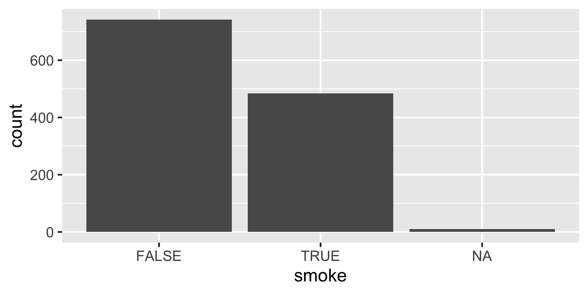
$ smoke <lgl> FALSE, FALSE, TRUE, FALSE, TRUE, FALSE, FALSE, FALSE, FALSE,…Basics of Data Visualization
ISI-BUDS 2025
Bar plot

- When can we use a bar plot?
- What does this bar plot convey?
Bar plot

Bar plot
Bar plot
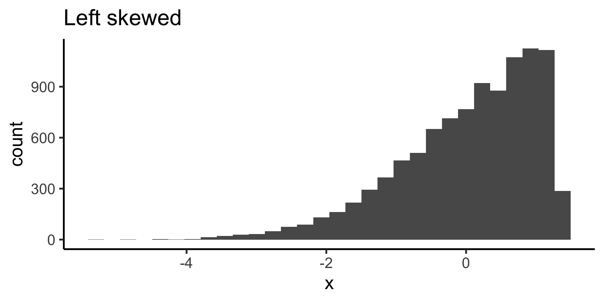
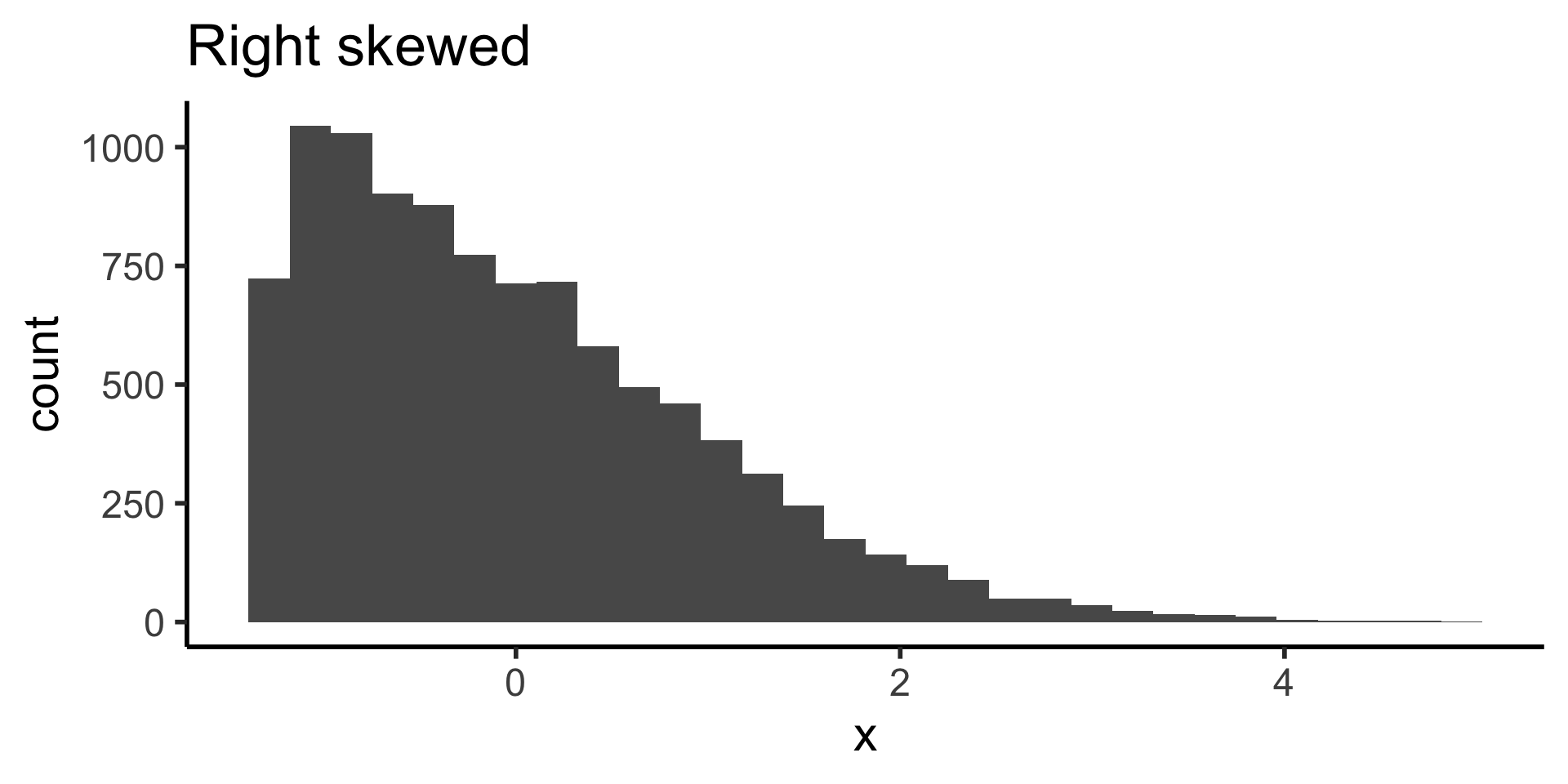
Histogram

- When can we use an histogram?
- What does this histogram convey?
Histogram

Histogram
Histogram
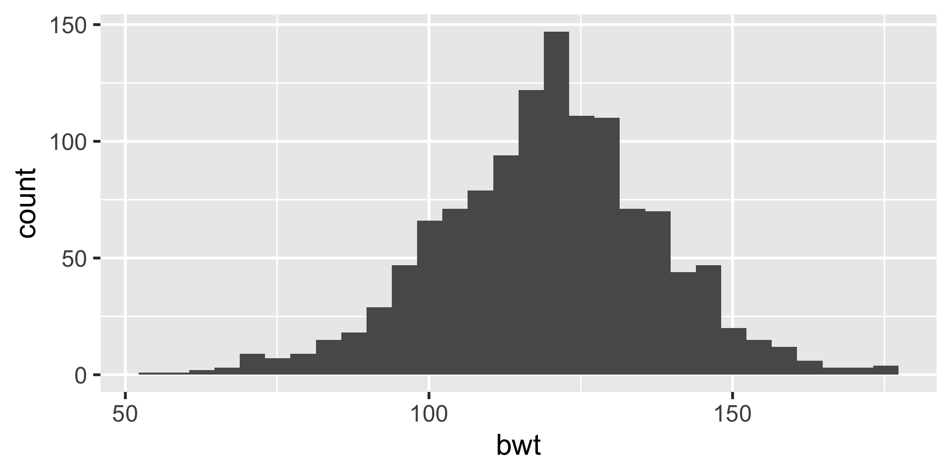
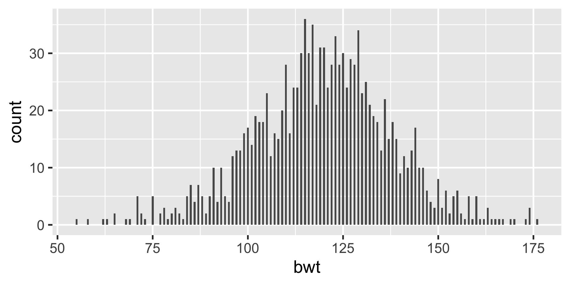
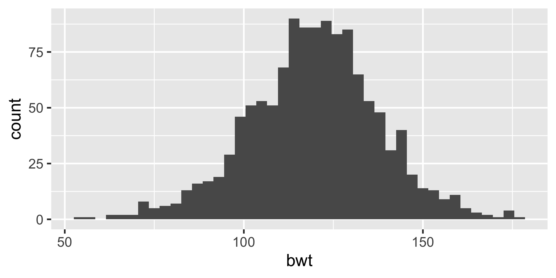
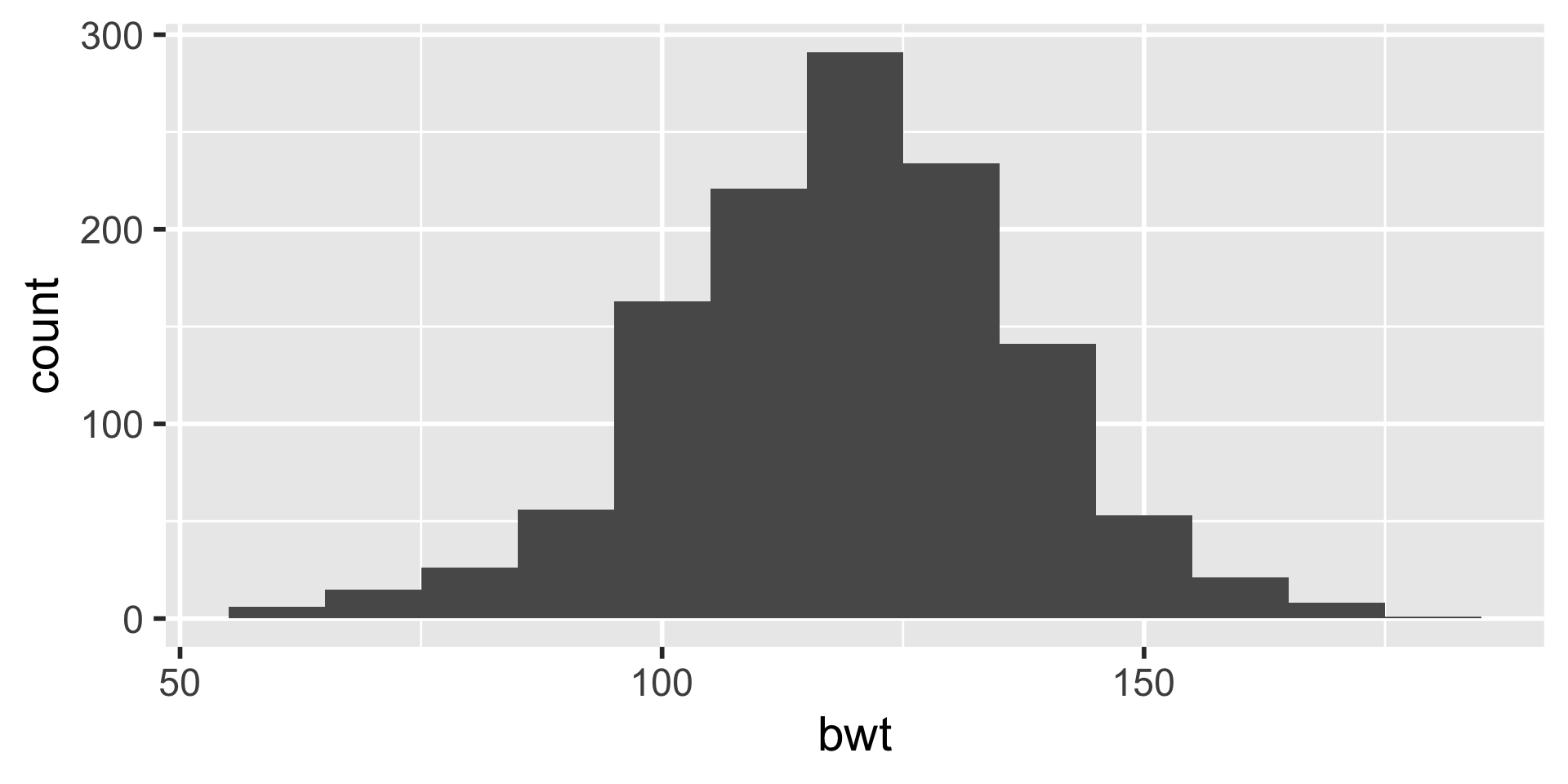
Binwidth


Standardized Bar Plots
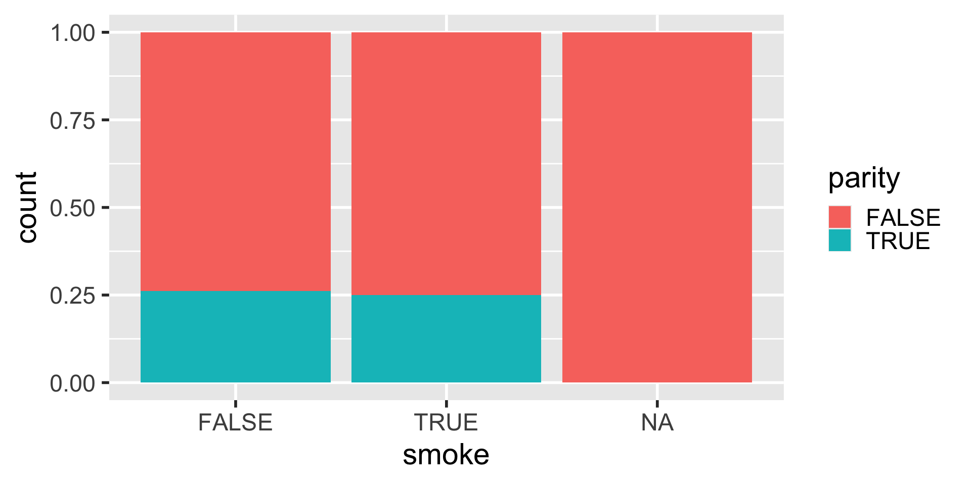
Note that the y axis still shows as a count. We will learn how to change the axis labels in the next lecture.
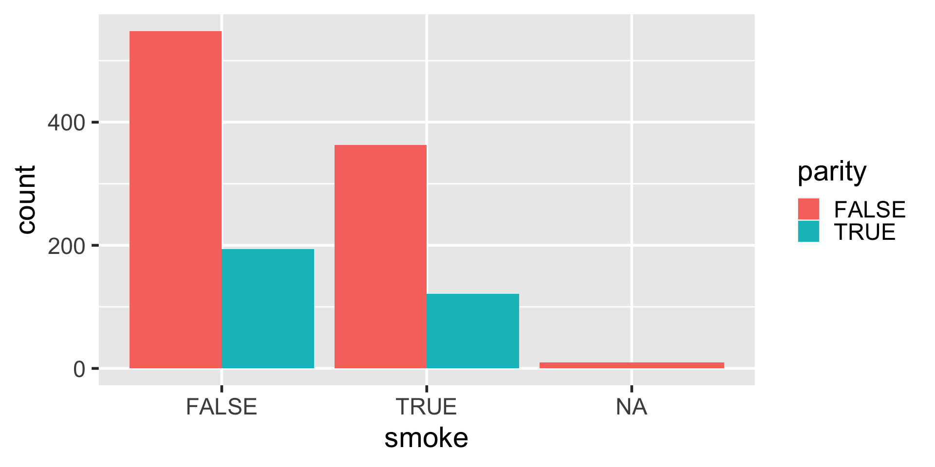
Dodged Bar Plot
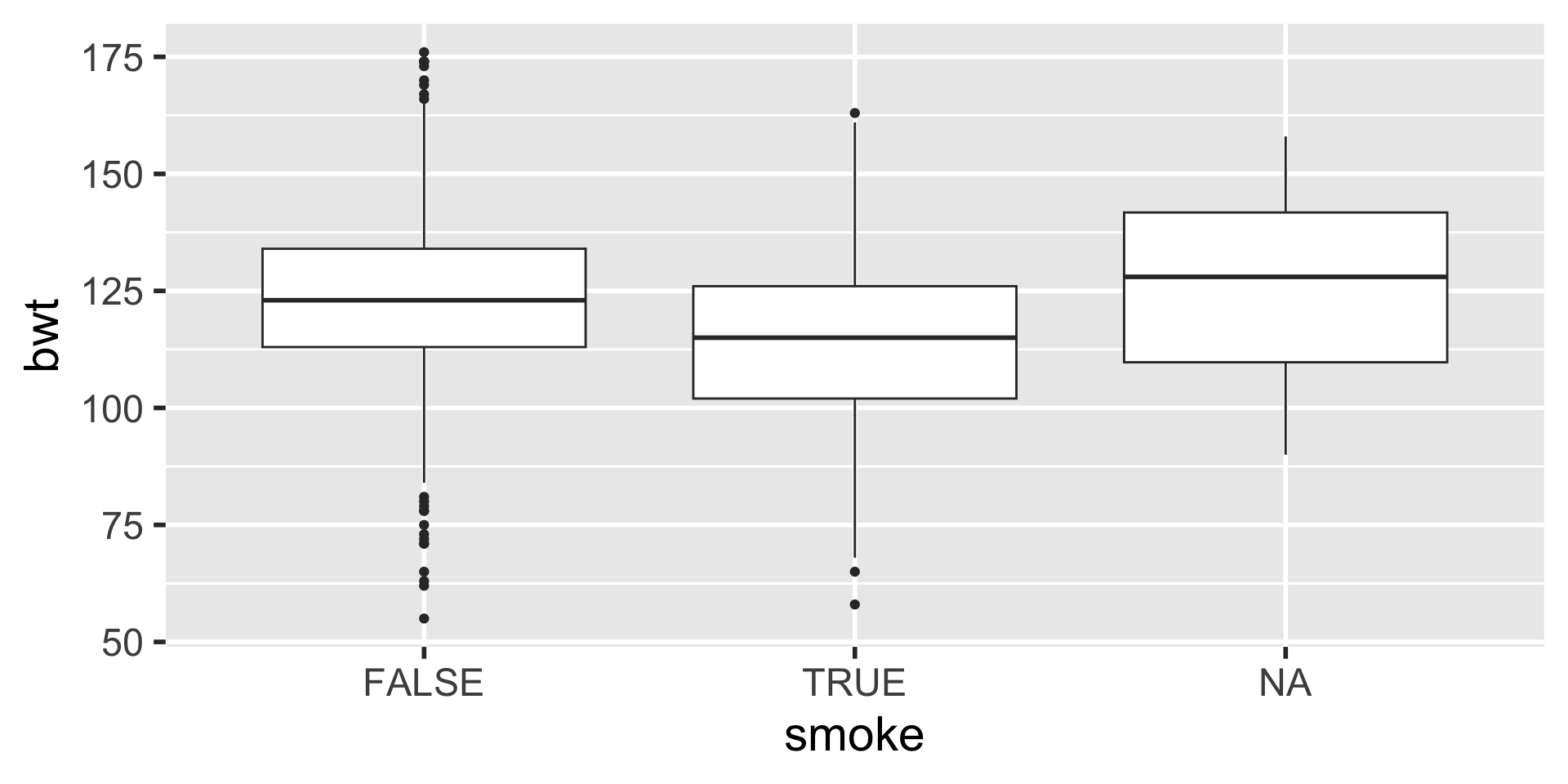
Side-by-Side Boxplots
Scatter plots
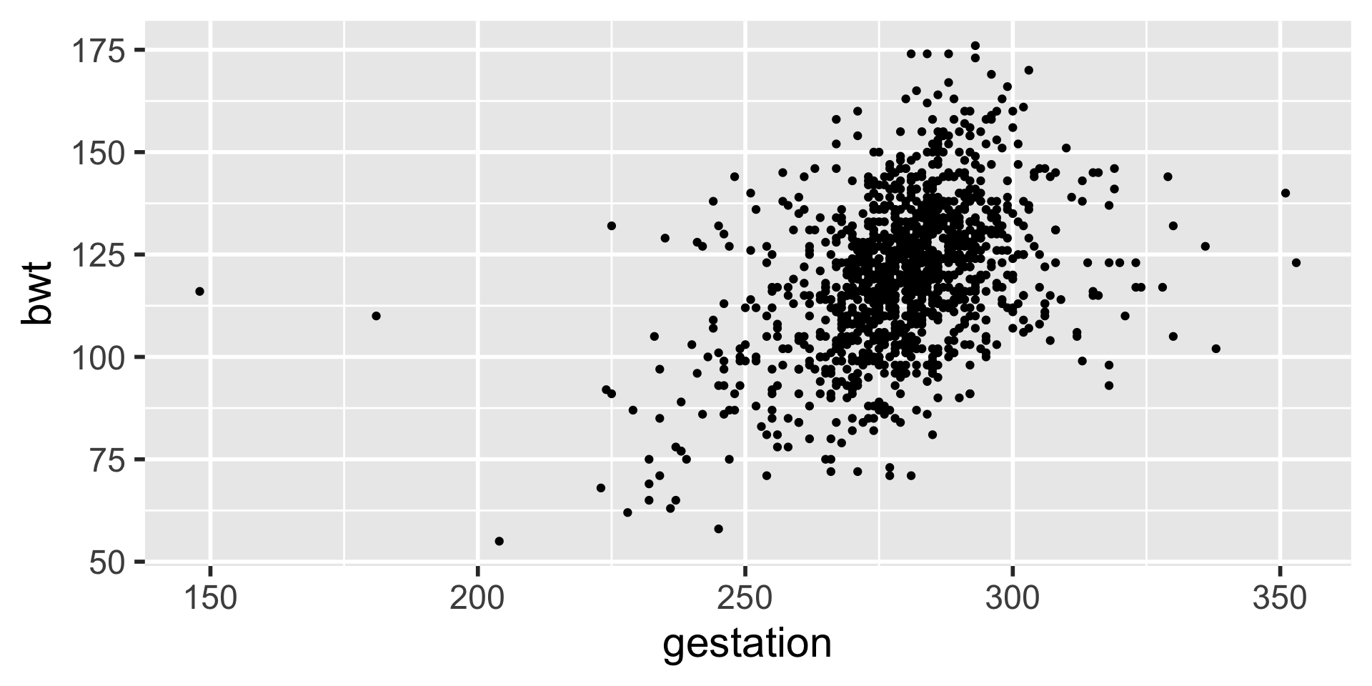
Length of gestation can possibly eXplain a baby’s birth weight. Gestation is the eXplanatory variable and is shown on the x-axis. Birth weight is the response variable and is shown on the y-axis.
Linear Relationship
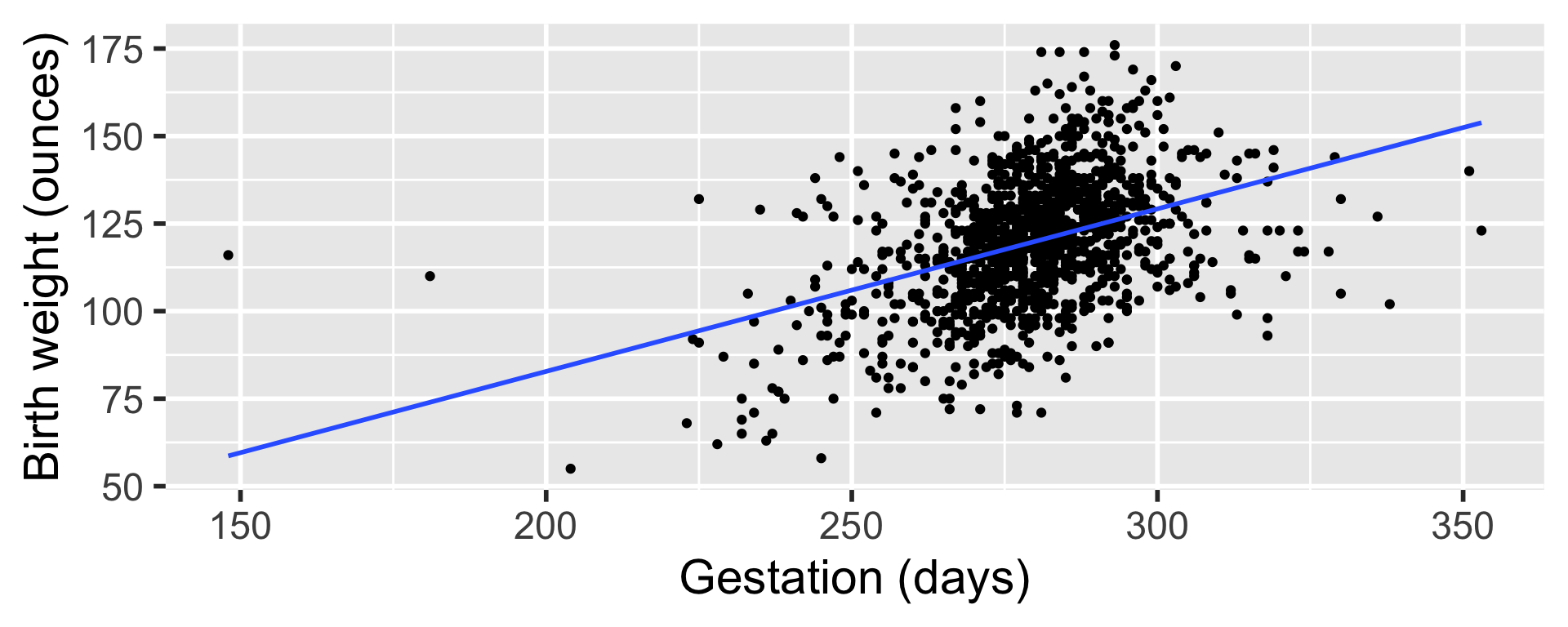
Later on we will start statistical modeling during which we will numerically define the relationship between gestation and birth weight. For now we can say that this relationship looks positive and moderate.
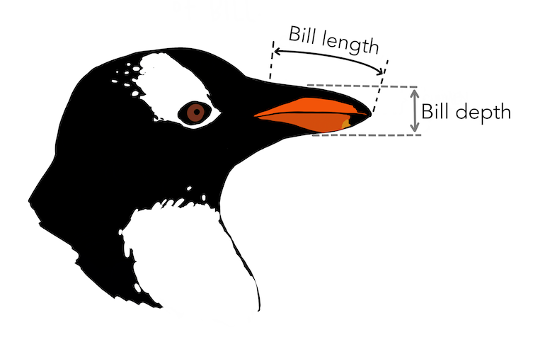
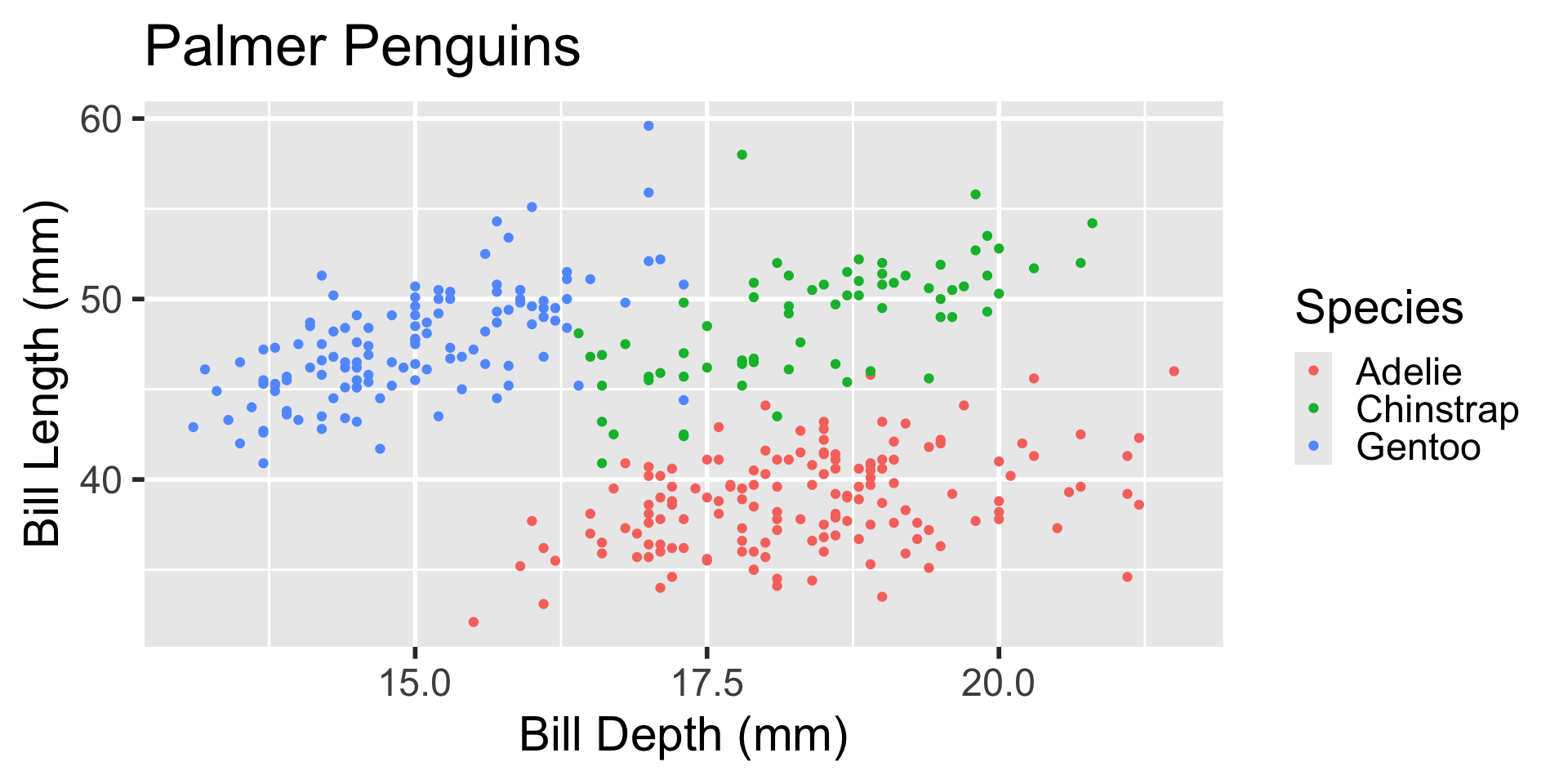
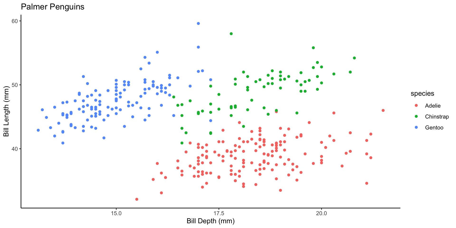
Meet Palmer Penguins1

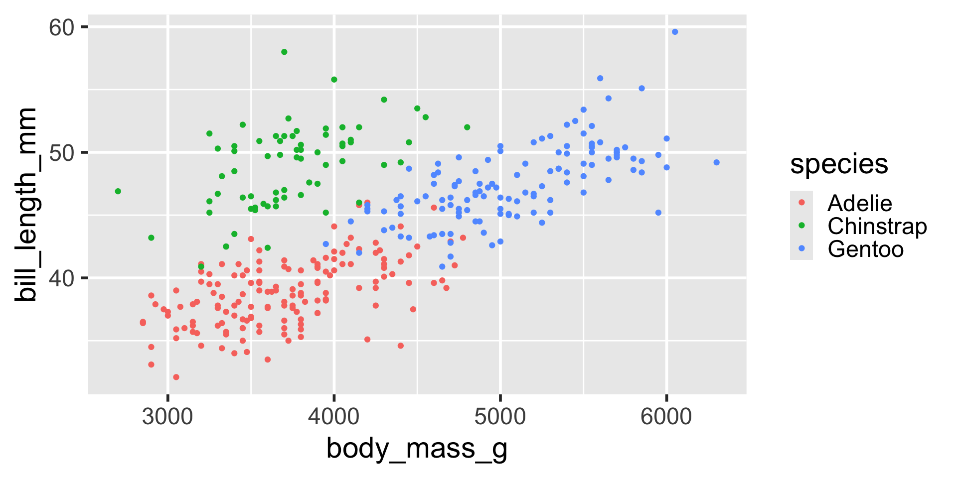
Visualizing Three Variables
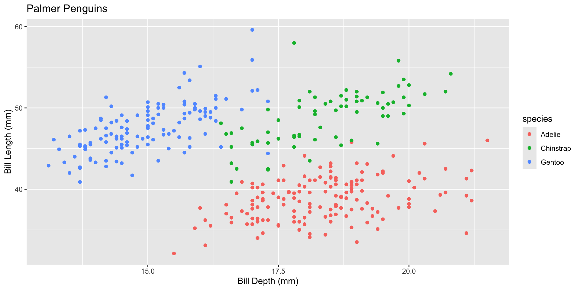
Labeling Axes
We can change axes and plot labels using the labs() function.
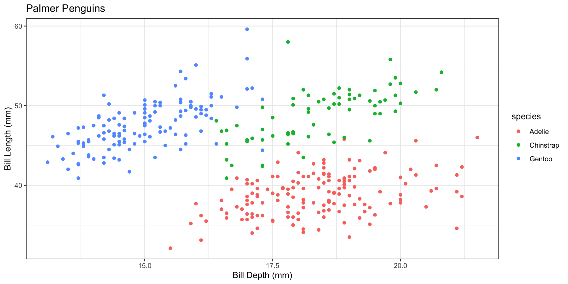
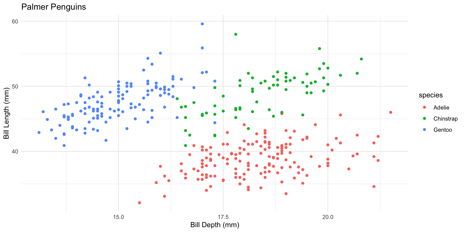
Themes
Theme gray is the default theme in ggplot.
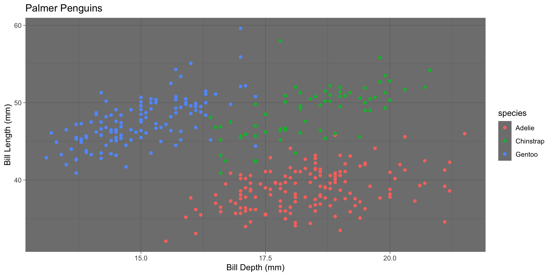
Font Size
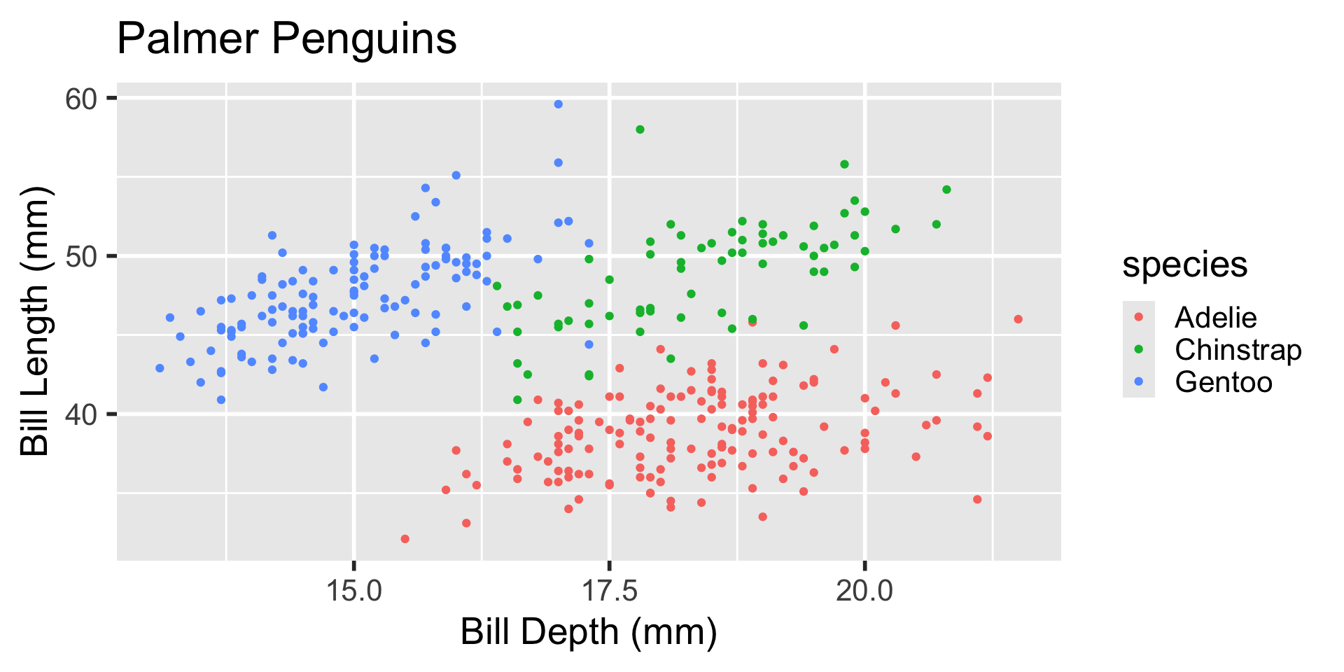
The theme() function allows for many components of a theme. By typing ?theme in the Console, you can read the documentation of the function to see what components can be modified.
Using Shapes in Addition to Colors
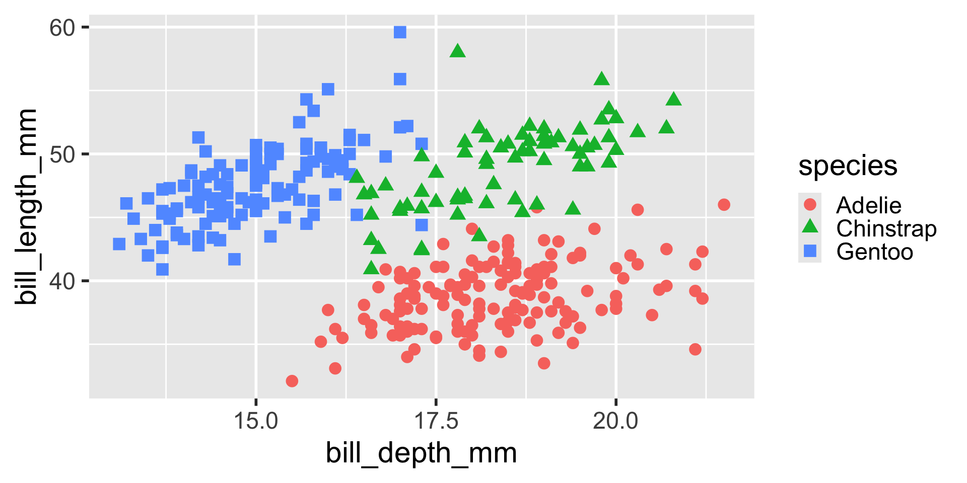
Previously species were only distinguishable to someone who could distinguish these colors. By using shapes, color-blind viewers can also distinguish the species.