01:00
Advanced Data Visualization
ISI-BUDS 2025

North Circumpolar Region from the Dunhuang Star Chart circa 649-684 CE.
Recommended reading
Funkhouser, H. G. (1937). Historical Development of the Graphical Representation of Statistical Data. Osiris, 3, 269–404. Chapter 2 is on The Origin of the Graphic Method.
Assessed value of household and kitchen furniture owned by Black people in Georgia.
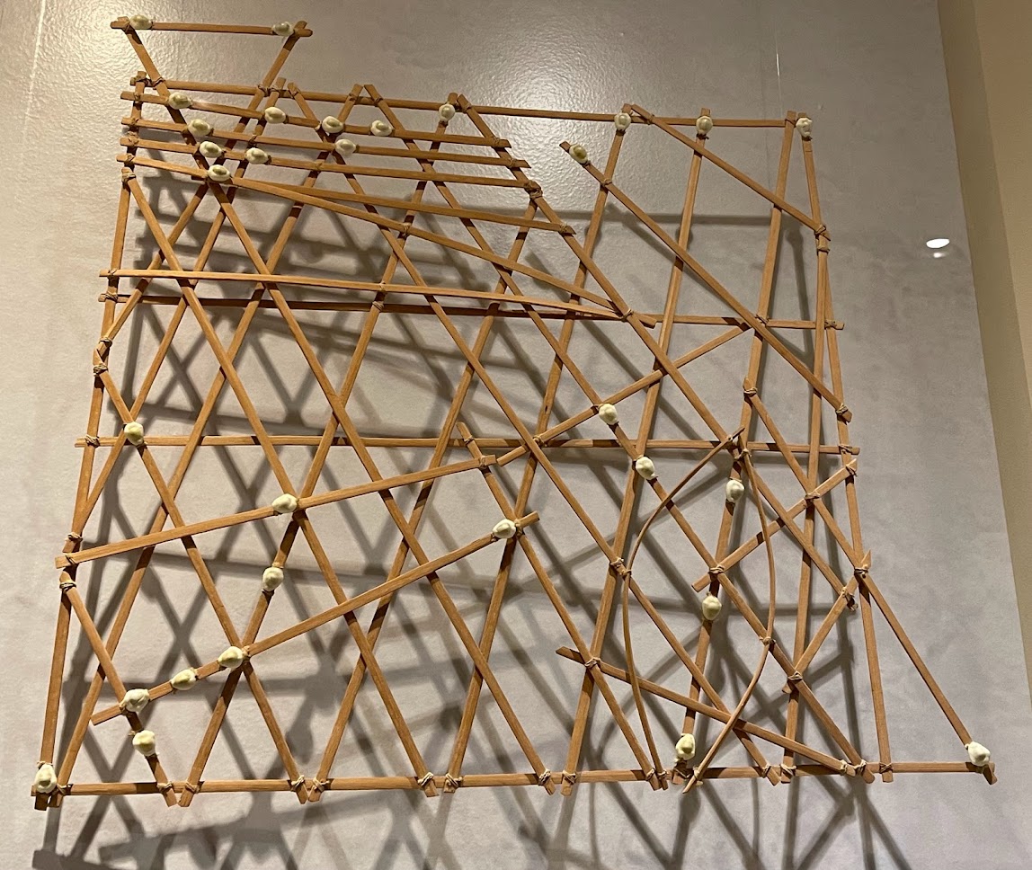
20th century navigational chart from Kwajalein Attoll, Marshall Islands, Micronesia on display at Bower Museum in Santa Ana. Photo by Mine Dogucu.
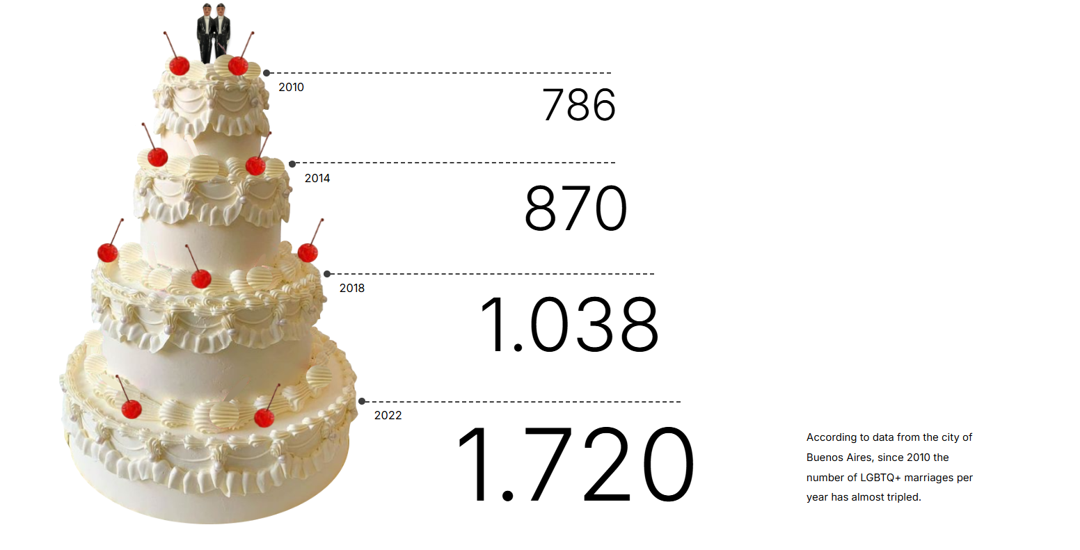
Same-sex marriages in Buenos Aires City by Macarena Zappe

COVID related deaths table by the Economist


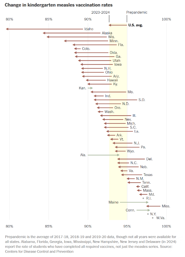
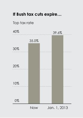
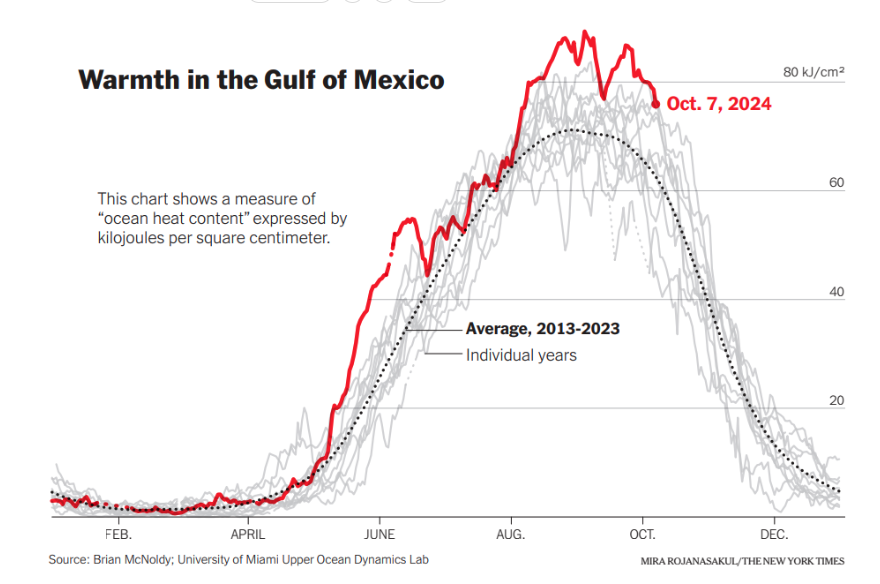
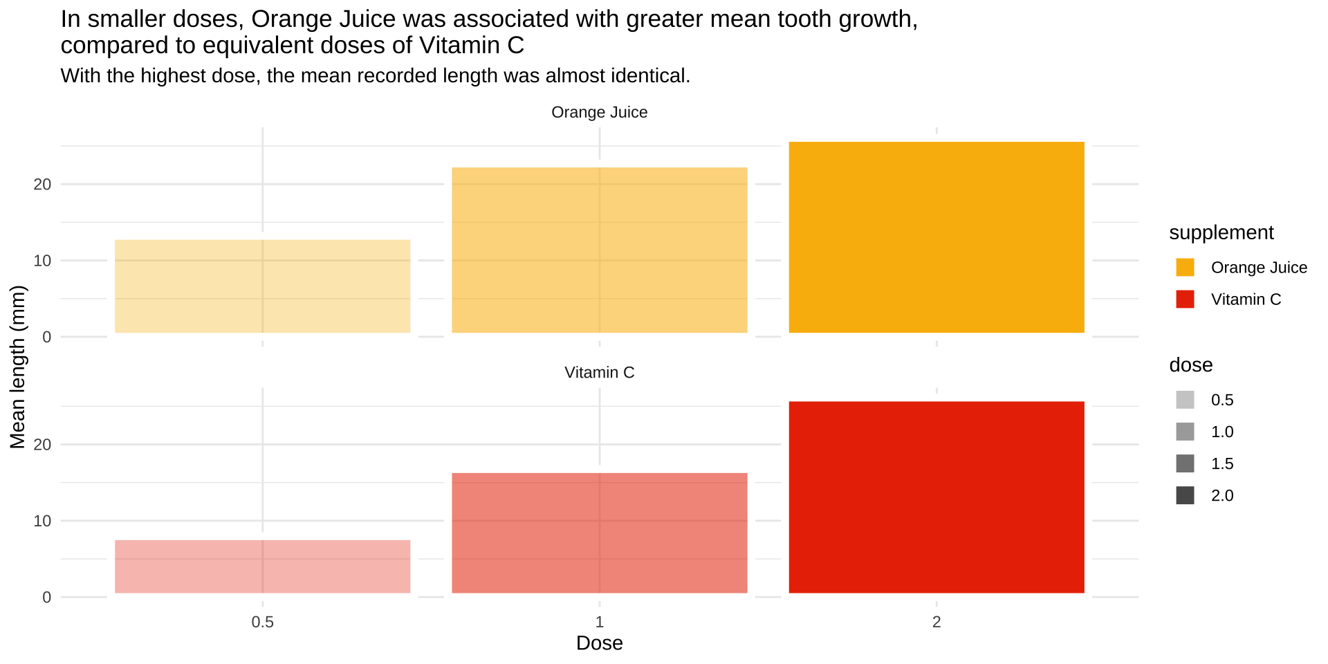
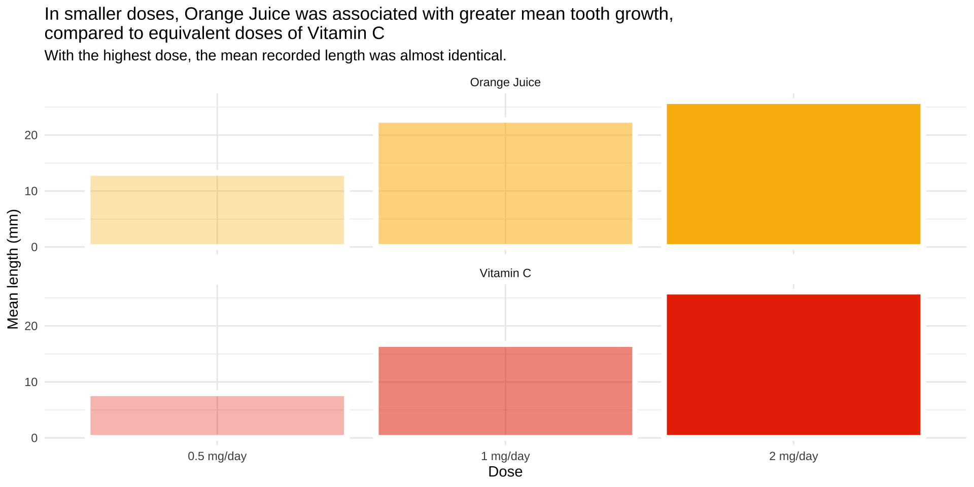
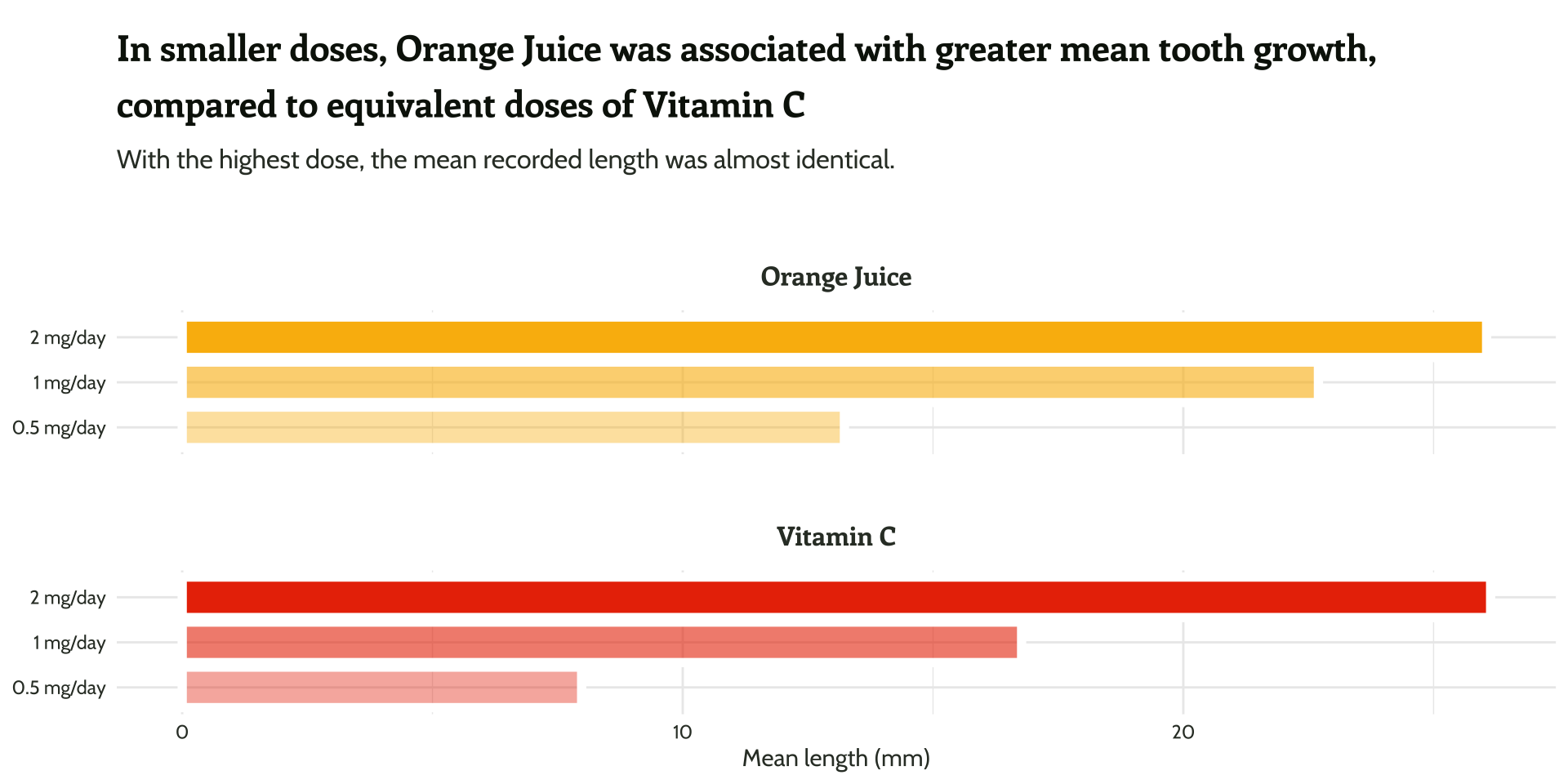
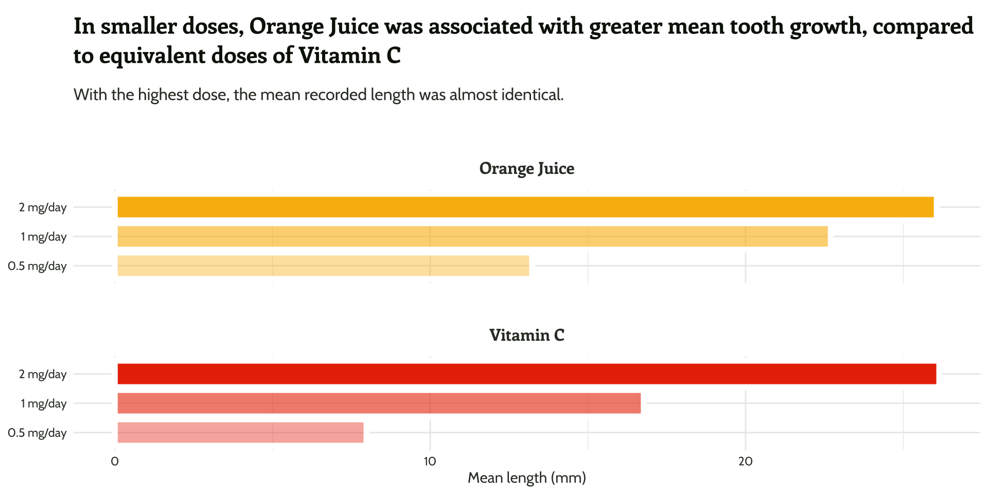
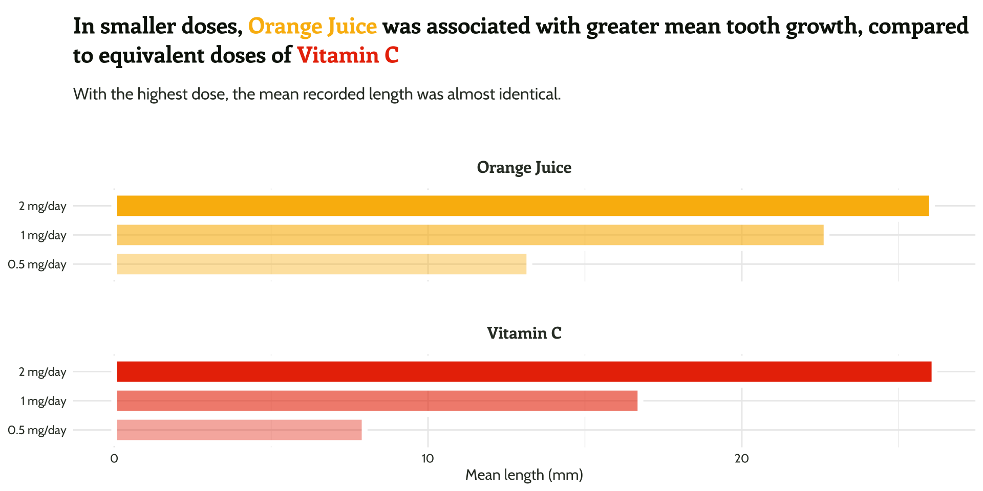
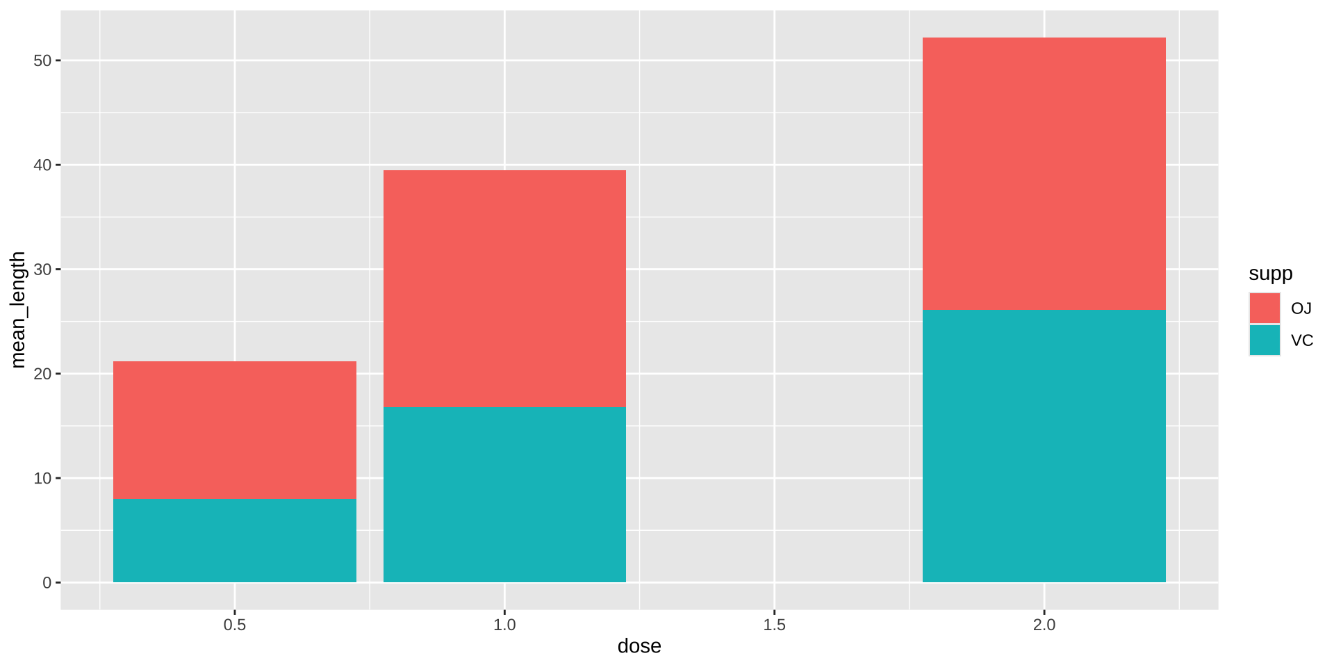
Truncated Axis

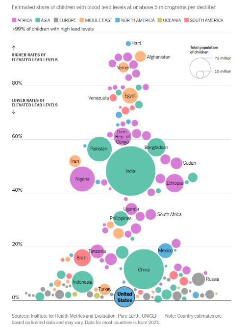
“The principle of proportional ink: The sizes of shaded areas in a visualization need to be proportional to the data values they represent.” (Bergstrom and West, 2016)
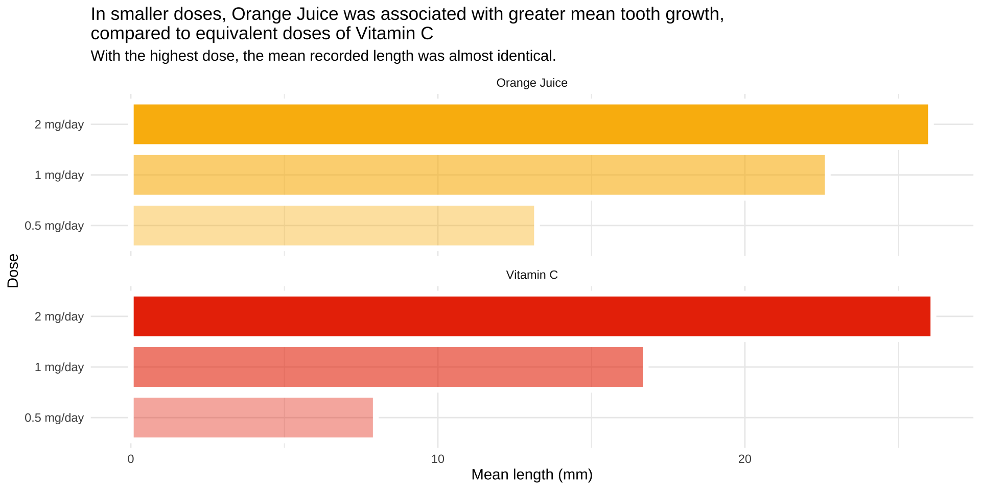
Aspect ratio

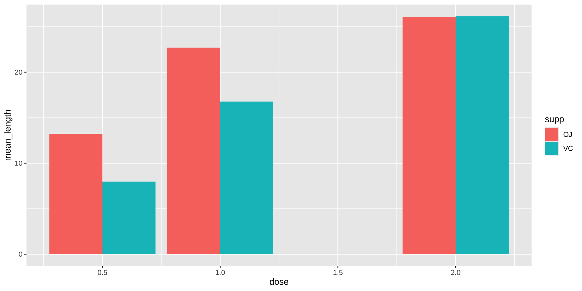
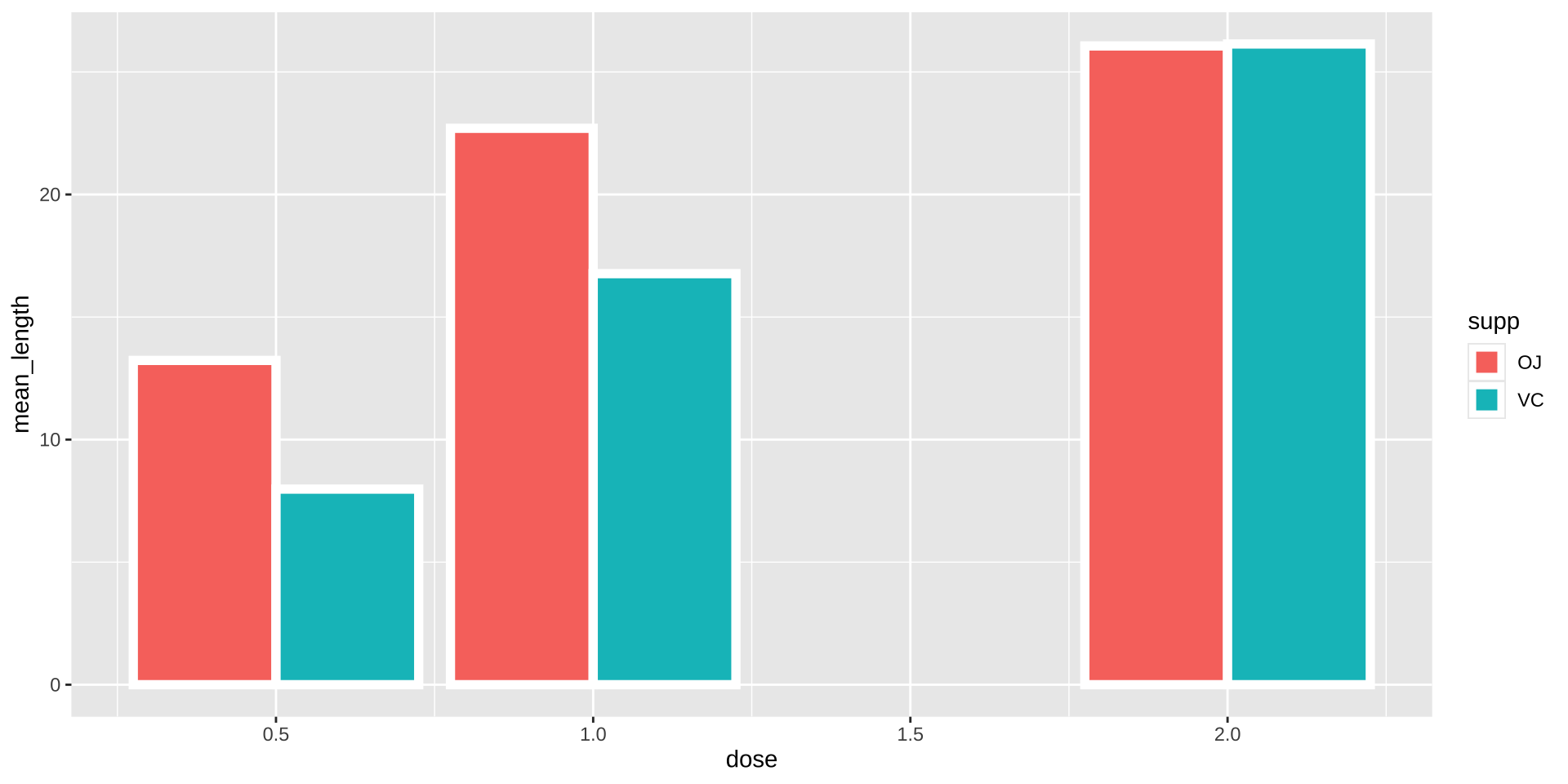
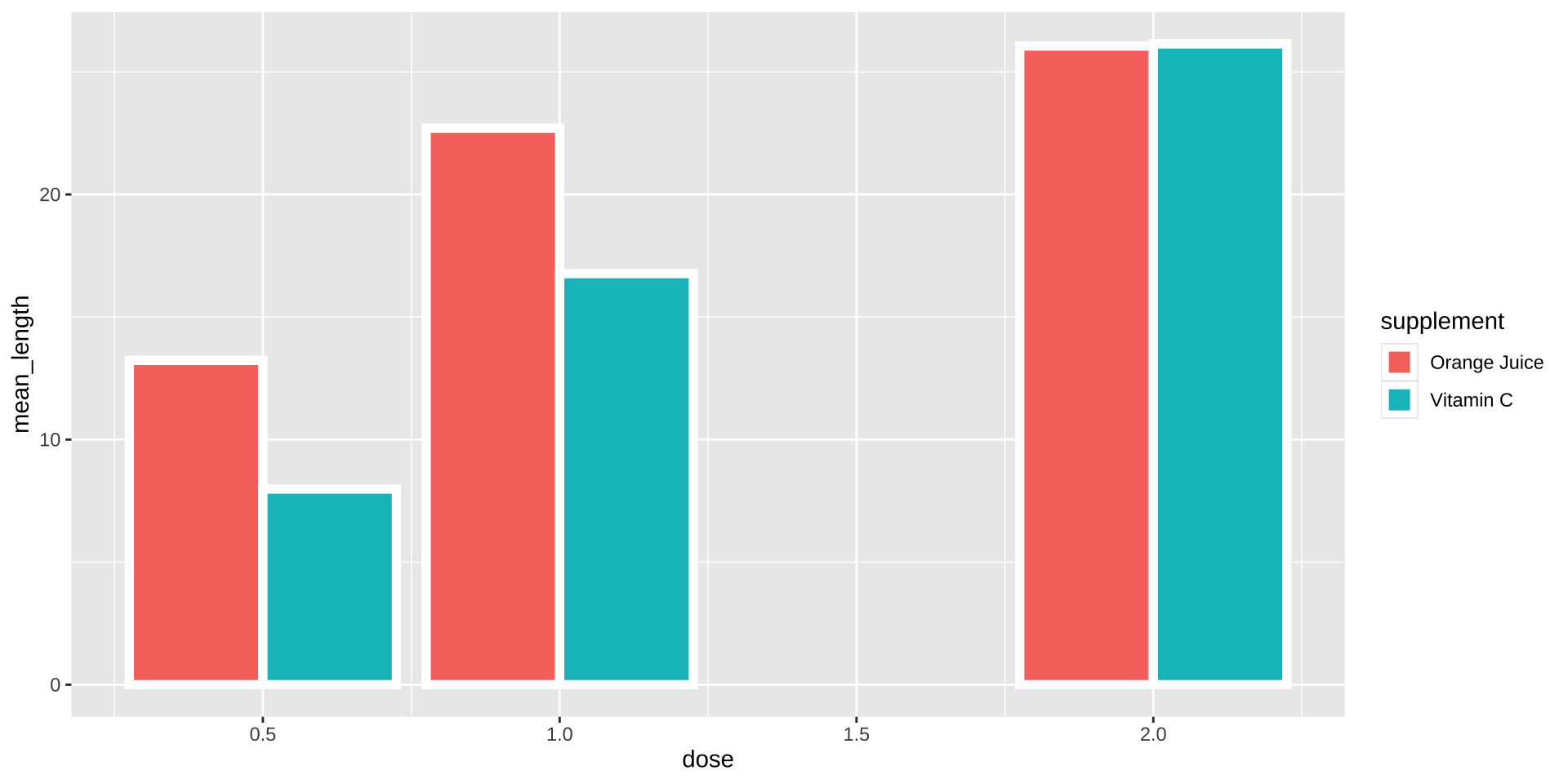
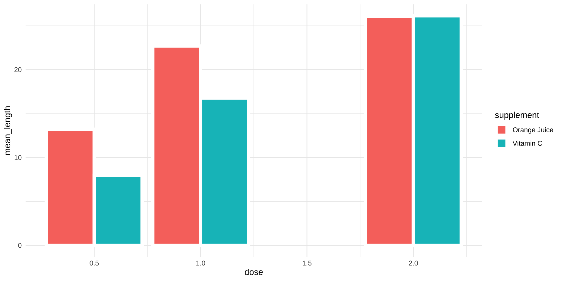
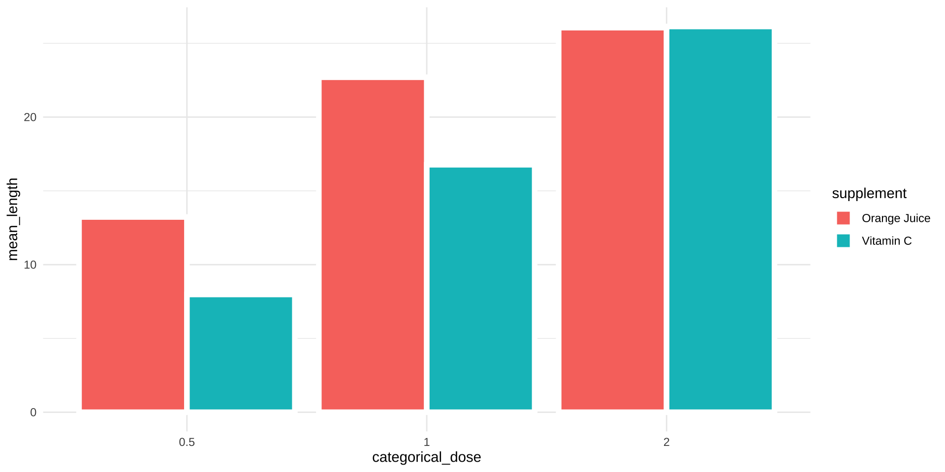
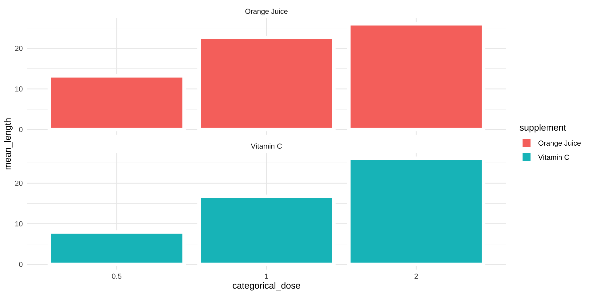
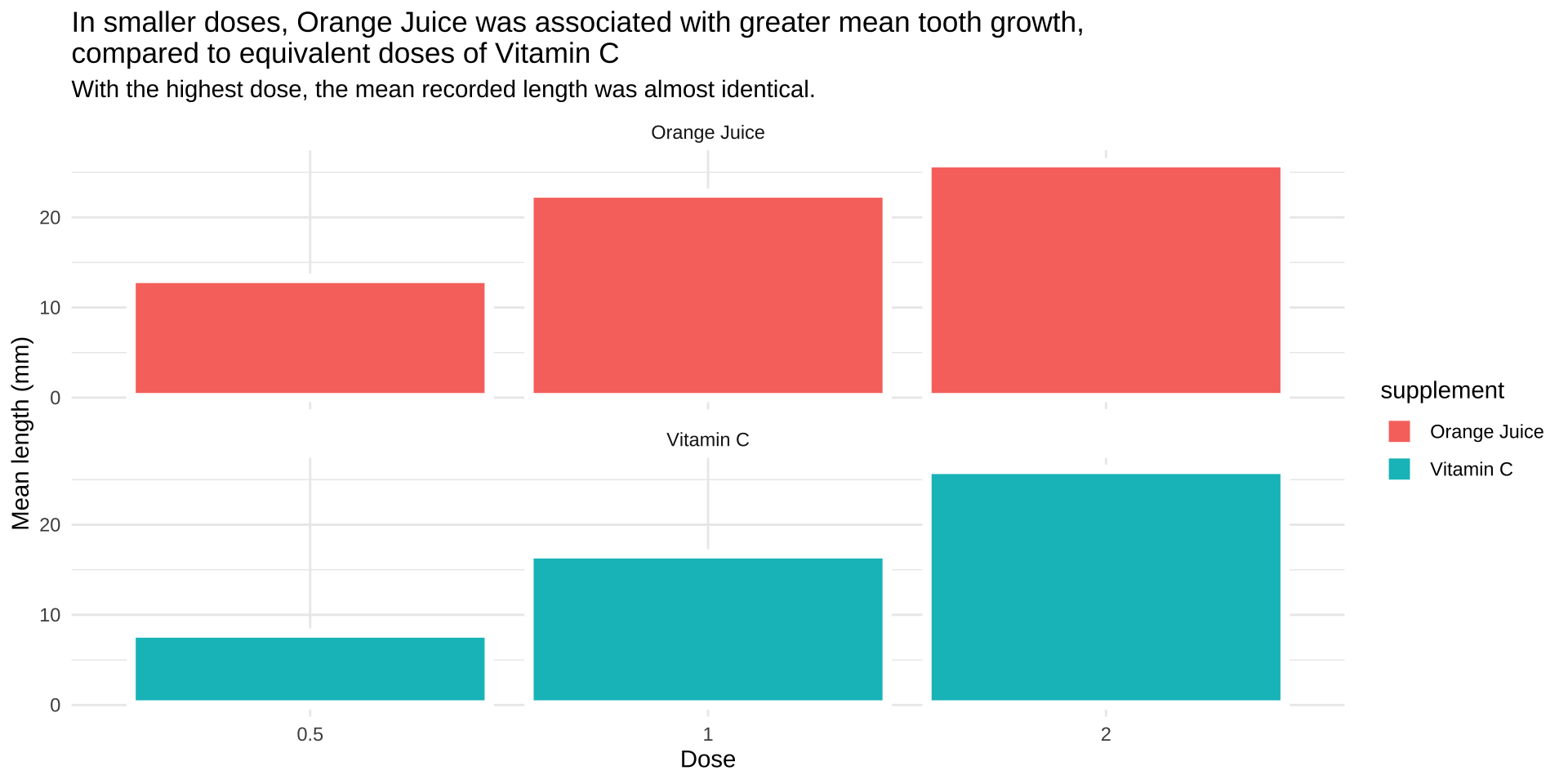
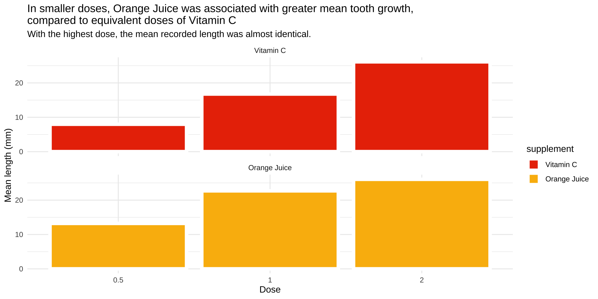
Color for grouping
Color for representing numeric values
Color for emphasis
Color Theory
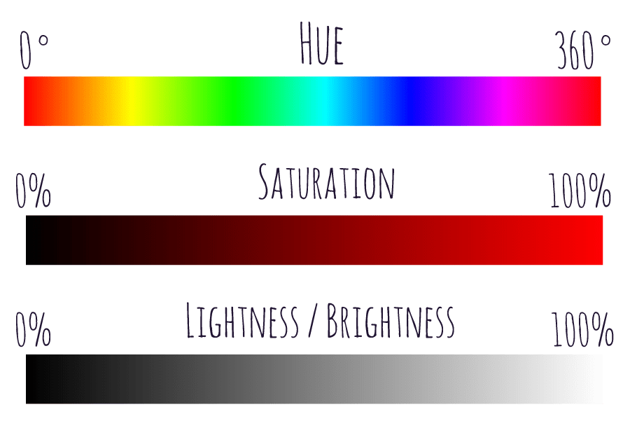
Okabe-Ito Color Palette

The codes displayed with a hashtag are called hex color code. You can use hex codes in R (and in HTML) to specify colors.
Color-Blindness Simulation

Okabe-Ito Color Palette

Okabe-Ito Color Palette
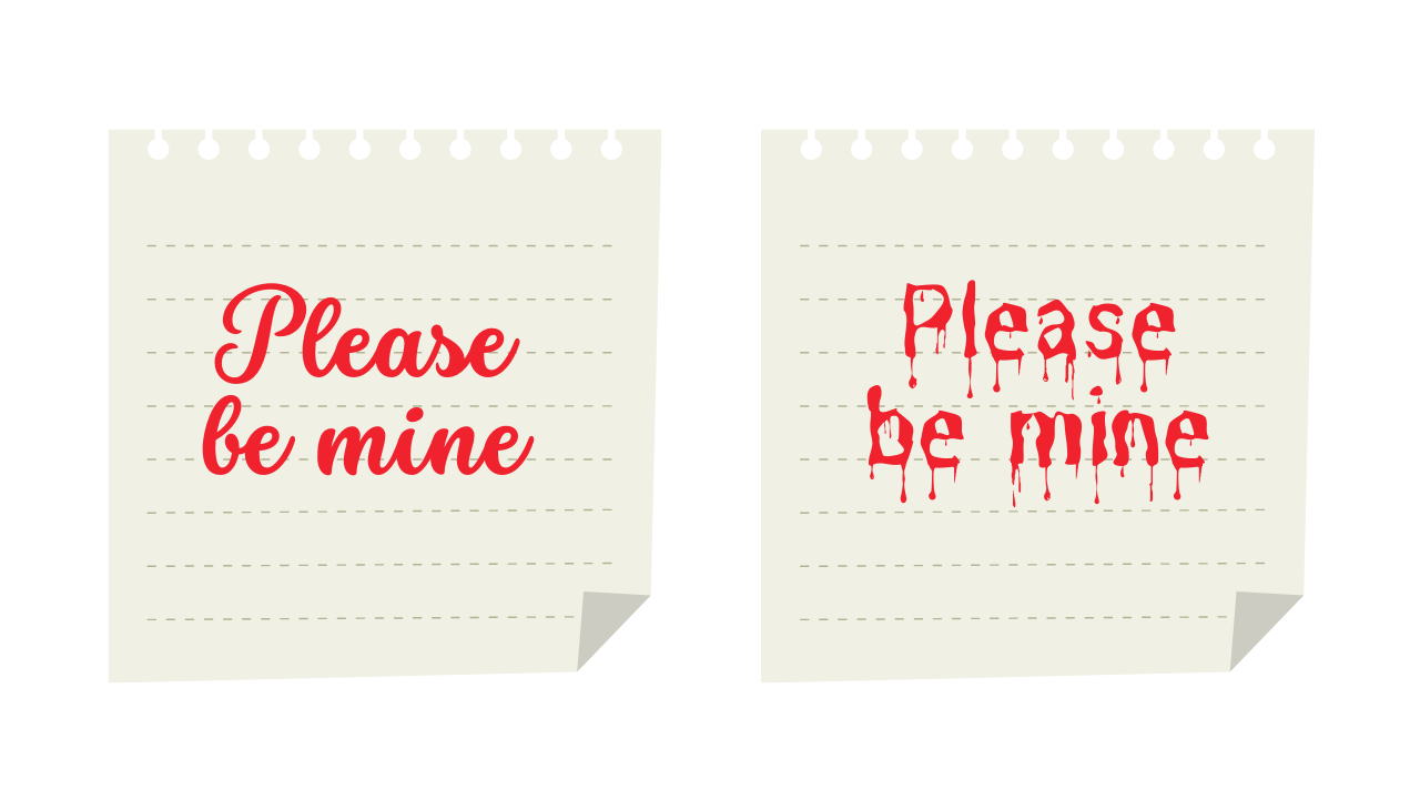
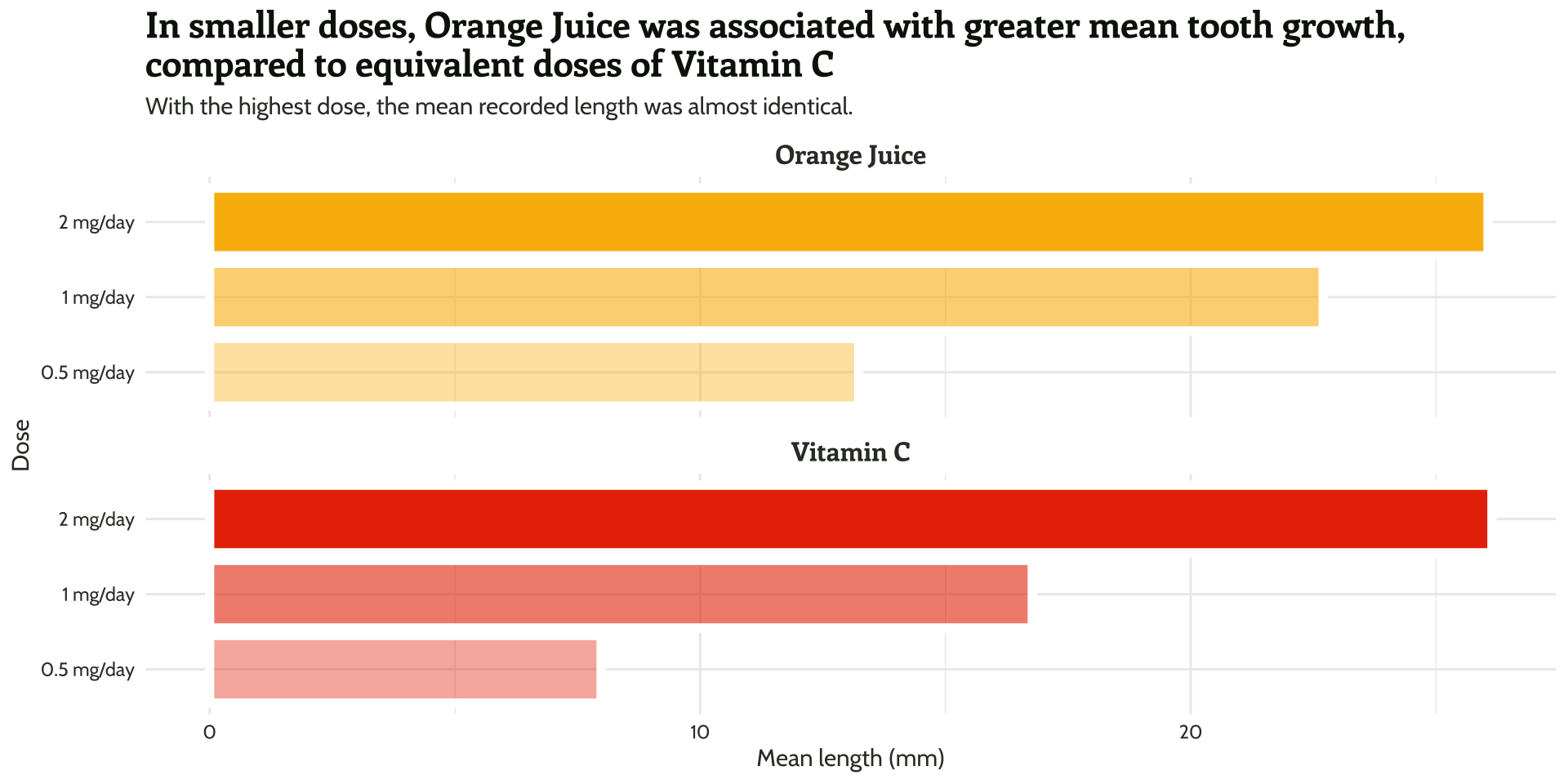
Fonts matter for clarity

Fonts matter for the message
Tip
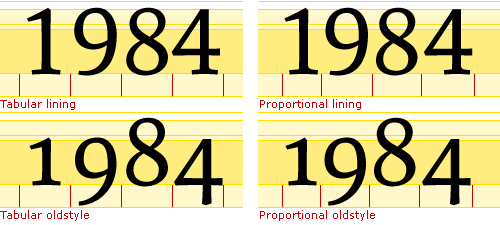
Use lining and tabular fonts for numbers.
Alt Text in Quarto
```{r}
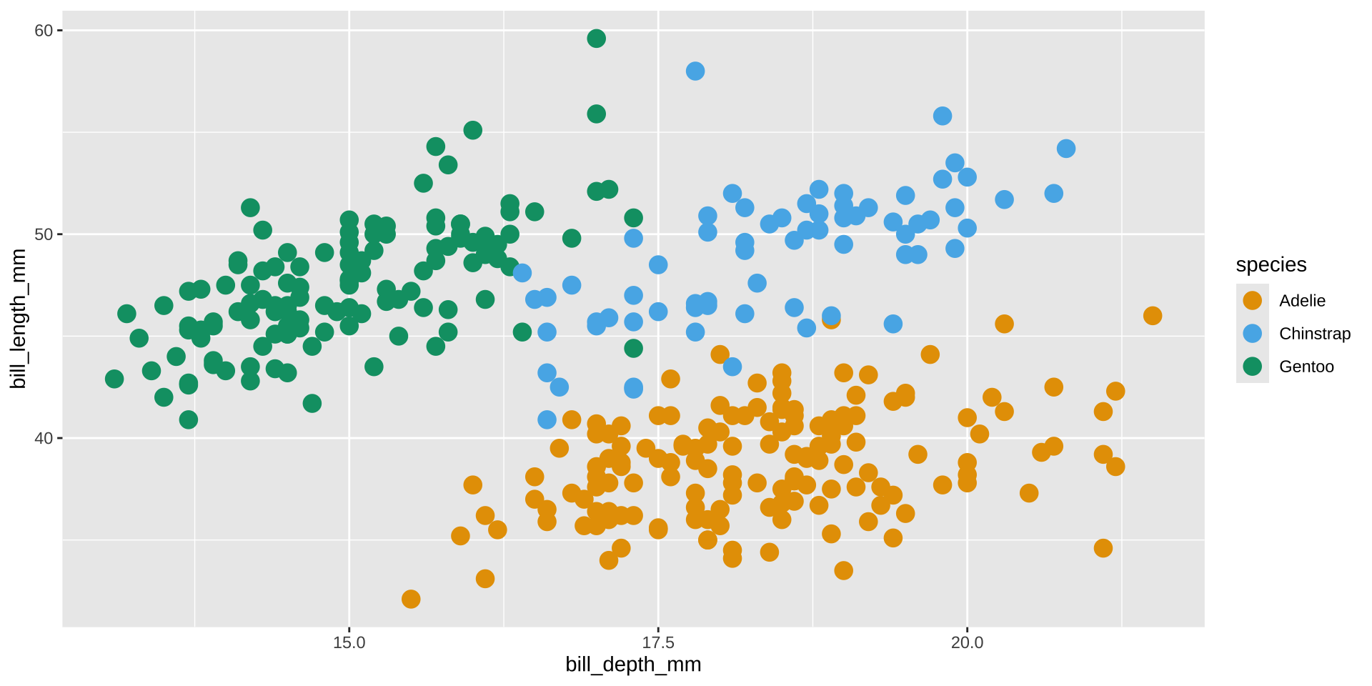
#| fig-align: center
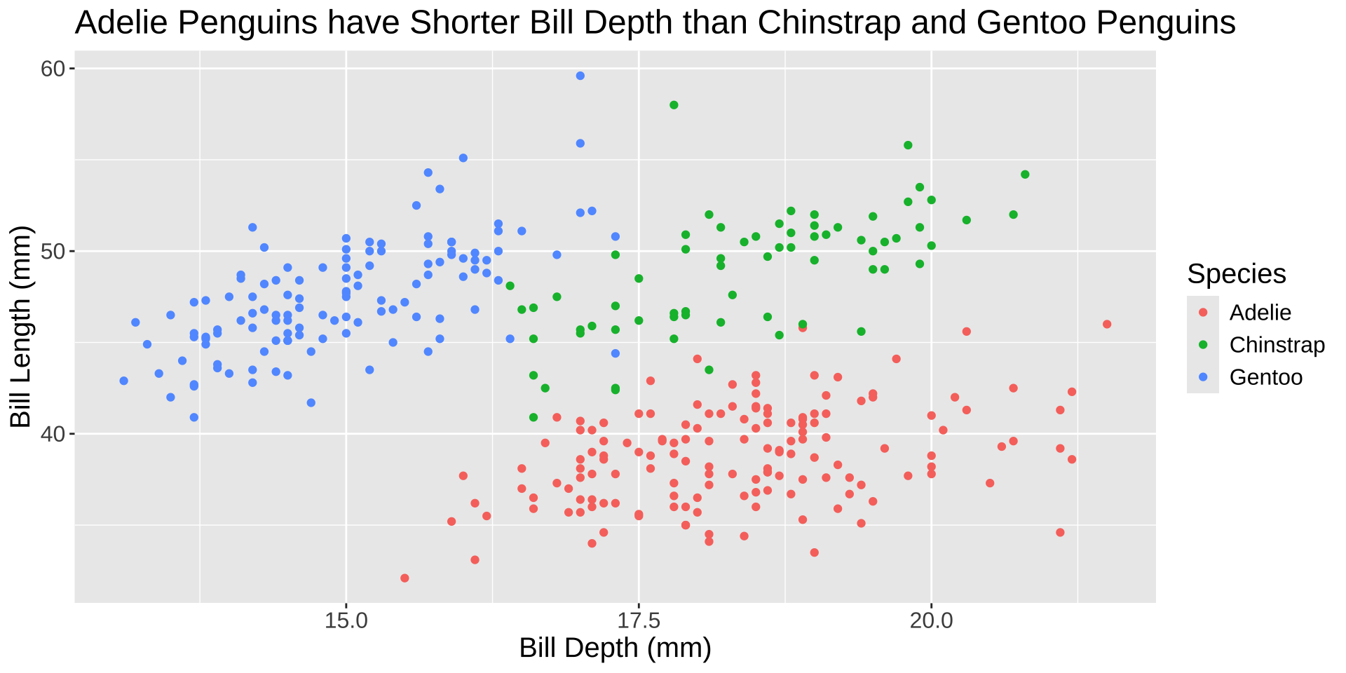
#| fig-cap: Relationship between bill depth (mm) and length (mm) for different species of penguins
#| fig-alt: The scatterplot shows bill depth in mm on the x-axis and bill length in mm on the y-axis with points differently colored for different species as Adelie, Chinstrap, and Gentoo. The x axis ranges from about 12.5 mm to 22.5 mm. The y-axis ranges from about 30 to 60 mm. For all species the relationship seems moderately positive. When comparing the three species, Adelie penguins seem to have longer bill depth but shorter bill length. Chinstraps have longer bill depth and longer bill length. Gentoo penguins have shorter bill depth and longer bill length.
ggplot(penguins, aes(x = bill_depth_mm,
y = bill_length_mm,
color = species)) +
geom_point(size = 4)
```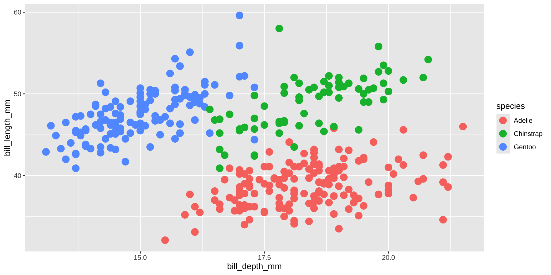
Relationship between bill depth (mm) and length (mm) for different species of penguins
Don’t make the viewer squint

Data context


Tip
Do not rely on software defaults for font size, font type, colors, labels, text alignment, legend, etc. without intention.